
The Life Cycle of the Stars

Classifying Stars
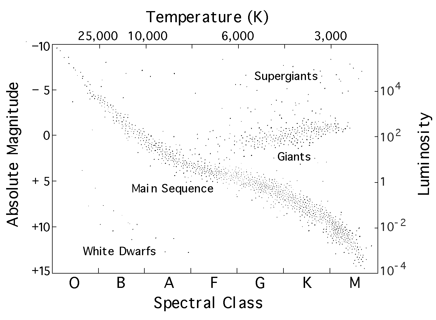
“The most important diagram for stellar evolution is known as the Hertzsprung-Russell (HR) diagram.”
– Professor Derek War-Thompson (2011).
To classify stars astronomers use HR diagrams. A HR diagram plots the luminosity (total energy emitted per second) against star colour, or temperature. The diagram above shows the positions of the stars within our solar neighbourhood, as you can see the majority of the stars lie within a central band that cuts right across the centre of the diagram, with a large cluster in the top right zone. From this it can be seen that the faintest stars have red colours, whereas the bright stars have blue colours.
As a star moves through its life cycle it will appear in many different positions on a HR diagram. Initially when it becomes a main sequence star it will simply move along the central band, however as it approaches the end of that portion of its life it could take several different paths. Some stars even do loops on the diagram going back on themselves!
Spectral Class:
Stars are classed by their spectra (absorption lines shown {colour}). The spectra also can tell us roughly what the surface temperature of a star is.
